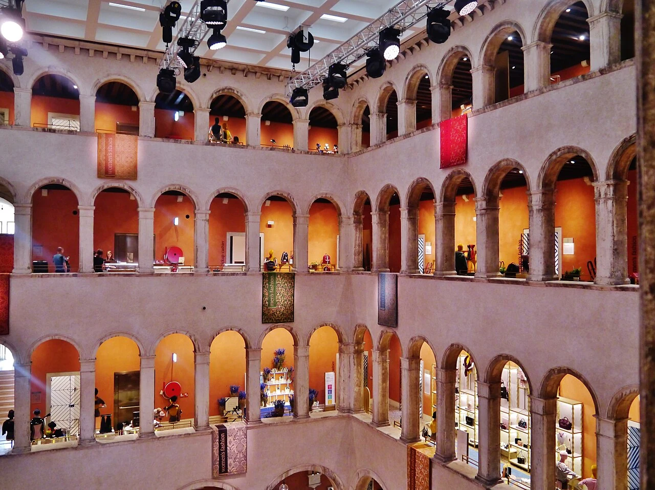
G-SHOCK’S WRISTWATCH TWIST! THE NEW 2500 SERIES REDISCOVERS HANDS
Casio starts again from the shape of its first G-SHOCK and changes the way of showing the hour. Inside the new look of the GMC-2500 and GAC-2500, between memory of the eighties and details to be observed closely.
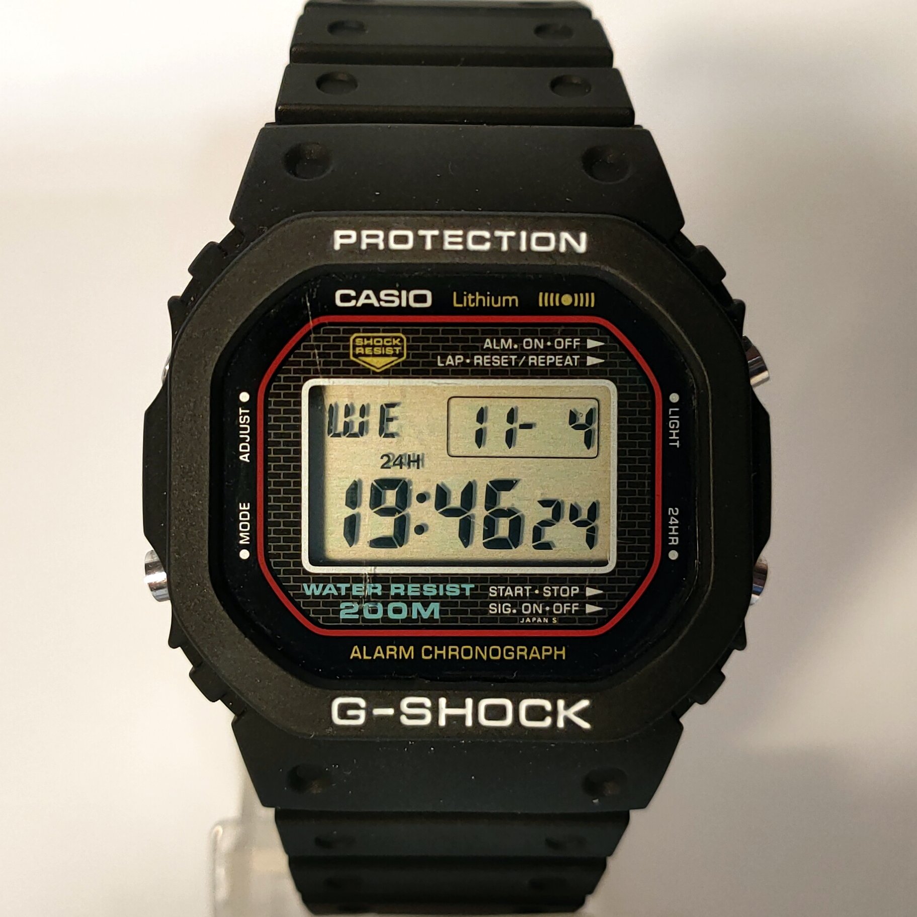
There are accessories that we recognize before we even read its name. For a G-SHOCK it takes a firm form, the buttons, that air from object ready to follow us everywhere. Now Casio takes one of his most familiar silhouettes and brings it in a different direction: an entirely analog dial.
The new GMC-2500 and GAC-2500 rethink the language of the DW-5000C, the first G-SHOCK of 1983. The news is not only that other watches are coming. It is an attempt to change a well-known face, leaving it recognizable: an exercise in style that concerns the relationship between an accessory and its history.
The shape is familiar. The quadrant changes tale
The 2500 series preserves the appeal to the octagonal case of origins and accompanies it with softer surfaces. On the quadrant, however, the hour passes from the hands. The project, presented by Casio under the name Depth in Shadow, works on the depth and effects of light.
In the launch statement, the brand insists on the curves of the case and the contrast with indices and dials more clearly. It is an interesting choice because it does not hide the presence of the watch: it makes it different. To understand if it convinces, it is worth looking at the object as a whole, without stopping at the first comparison with another famous model.
The starting point remains very precise: the old digital is not copied in every detail, but rereaded through another time display system. And a hand, in order to move, needs space: this changes the balance between full and empty.
That window doesn't just show the date
One of the central technical details is called Multi-Mission Date. The three-cell window, located at three o'clock, changes function depending on usage: it can show the date, timer minutes and setting information. It is therefore not a simple decoration on the dial.
By setting year, month and day you get an automatic calendar. The statement also indicates the possibility to stop the small second hand when it is not needed, to reduce battery consumption. These are characteristics to be understood before the purchase, because the traditional appearance does not describe on its own what the clock does.
Analog does not automatically mean mechanical. The word here describes how we read time. The aspect of the dial is not enough to deduce the type of movement, nor to attribute to this model the characteristics of a timepiece of another category.
GMC or GAC? The material also changes the effect
The official presentation distinguishes the GMC-2500, with metal-coated bezel and brass dial, from the GAC-2500 with resin dial. Different combinations of bracelets and straps also appear in the collection.
For those who choose an accessory to wear often, the difference does not end in the list of materials. Count the effect you want: a metal surface can become a bright point of the look; a more sporty strap changes the relationship with the rest of the clothing. They are possible styling, not a ranking between versions "righteous" and "wrong."
A simple shirt leaves room for the dial. A worked sleeve introduces another protagonist. Before adding bracelets, it can be helpful to look at how he is alone: not all accessories need company to get noticed.
A story started with a very concrete problem
The official history of Casio reports to April 1983, when the DW-5000C arrived. The idea was to face the fragility of the wristwatch through a construction capable of mitigating shocks. The identity page G-SHOCK recalls a work begun in 1981 and over two hundred prototypes made in about two years.
It is a less coated origin than you could imagine looking at an accessory become recognizable even in fashion. Before the look there was a problem to solve. The design came from an attempt to make something work, to protect it, to make it fit to be brought into real life.
Reading that story through the hands today means testing an identity: what details must remain for an object to continue to be itself? The new series proposes its own answer, but the last word belongs to who will wear it.
Before we choose it, let's try it on our day.
A product photo is a good start, not a test on the wrist. Actual dimensions, legibility, closure and fit deserve as much attention as color. Even the way the strap meets a sleeve can make a difference in everyday use.
If it appeals to you, try it on: read the dial, fasten the strap and lower your sleeve. You will see it many times a day; you should enjoy it even when checking whether you are late!
Meanwhile the novelty is clear: Casio tries to make us recognize a G-SHOCK reading the hour in another way. The nostalgia effect is there, but the detail to be observed is in front of us, on the dial. And perhaps the most useful question is simple: would we still like, even without the call to the eighties?
Source: Casio G-SHOCK ↗